
The Text Gradient Background extension in Atomic Addons allows you to add colorful gradient backgrounds to text elements and create eye-catching typography without writing custom code. It helps give headings, titles, and other text content a more modern and creative appearance by combining multiple colors with smooth gradient effects. With simple styling options and flexible controls, you can easily adjust the gradient to match your website’s design. This documentation will guide you through how to use and configure the Text Gradient Background extension in Atomic Addons.
Enabling the Text Gradient Background Extension #
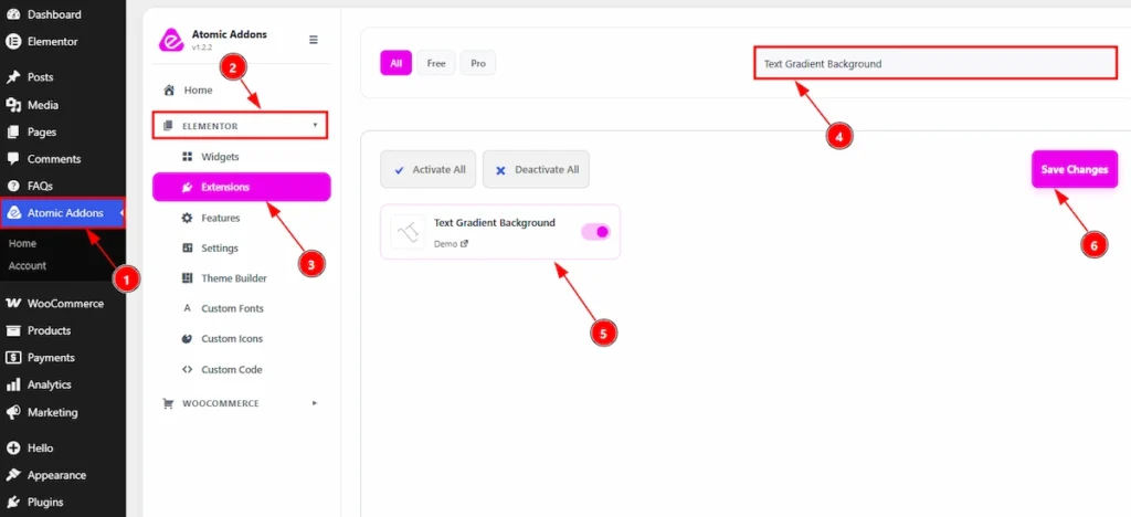
To use the Text Gradient Background Extension from Atomic Addons, first, you have to enable the extension.
- Go to WordPress dashboard → Atomic Addons Plugin dashboard.
- Then, click on the Elementor Tab and the sub items will open.
- Then, Click the Extensions Tab.
- Search for the Text Gradient Background Extension.
- Enable the Text Gradient Background Extension.
- Hit the Save Settings Button.
Place To Find The Text Gradient Background Extension #
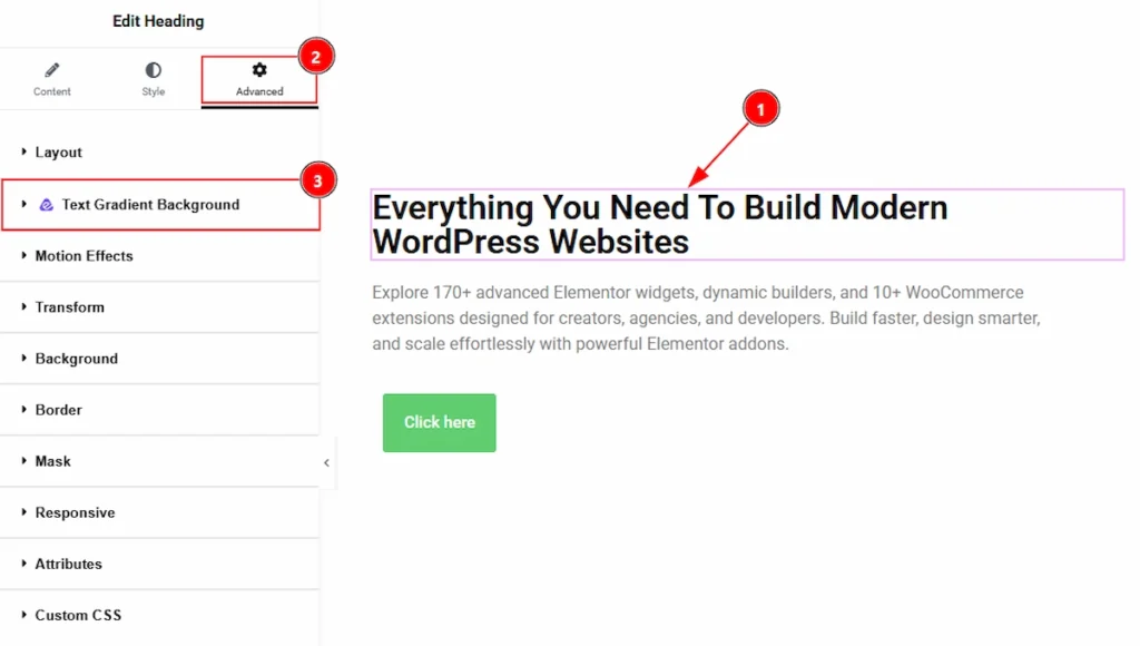
To find the Text Gradient Background Extension, you must need to select the element where you want to use the extension. Let’s see the steps below –
1. Click to text type elements which you want to configure by the Ripple Effects extension.
2. Now move to the Advanced tab.
3. You will find the Text Gradient Background extension here along with the Wow Elements logo.
Using the Text Gradient Background Extension #
In this part, we will configure both Heading & Button widget with the Text Gradient Background Extension. Let’s see how the Text Gradient Background Extension works on both widgets text. Let’s start with the Heading widget. As we have two settings for background classic & background. We will describe those one by one.
Heading Widget (Classic Background) #
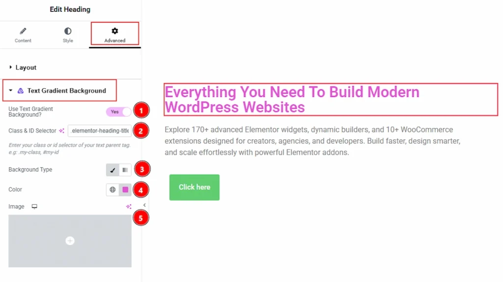
Select the Heading widget first and then move to the Advanced tab. After that open the Text Gradient Background and let’s see what we have here –
1. Use Text Gradient Background: Enable the switcher to use the text gradient background on the selected element.
2. Class & ID Selector: You can add the class & ID selector of the text parent tag here so that you can apply the extension here.
3. Background Type: You can choose the background type to be classic or gradient with this option. Here we have selected the background type as Classic.
4. Color: You can change the background color with this option.
5. Image: You can change the background image with this option.
Heading Widget (Gradient Background) #
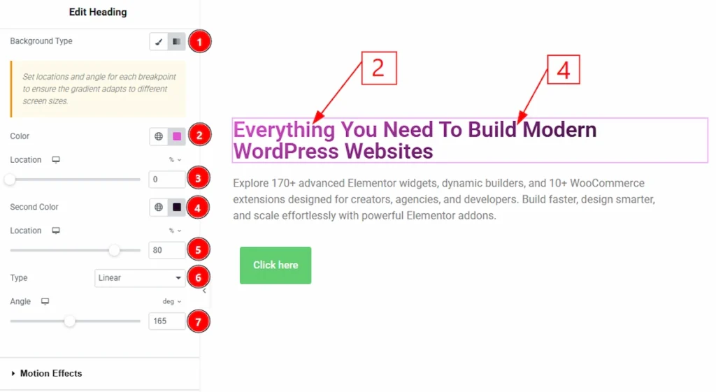
Now, let’s see what we have when we use the gradient background –
1. Background Type: You can change the background type to be classic or gradient with this option. Here we have selected the background type as gradient.
2. Color: You can set the starting color of the gradient effect applied to the text with this option.
3. Location: You can control the position of the first color within the gradient transition.
4. Second Color: This option define the ending color of the gradient effect.
5. Location: You can adjusts where the second color appears within the gradient flow.
6. Type: Allows you to choose the gradient style, such as Linear or Radial.
7. Angle: You can control the direction and rotation angle of the gradient effect for Linear gradients.
Button Widget (Classic Background) #
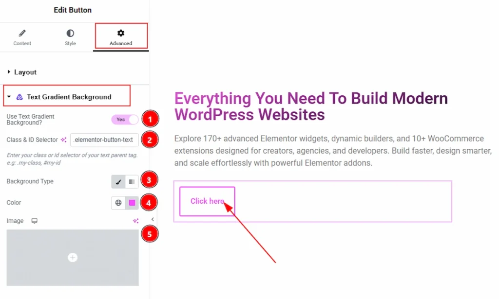
Select the Button widget first and then move to the Advanced tab. After that open the Text Gradient Background and let’s see what we have here –
1. Use Text Gradient Background: Enable the switcher to use the text gradient background on the selected element.
2. Class & ID Selector: You can add the class & ID selector of the text parent tag here so that you can apply the extension here.
3. Background Type: You can choose the background type to be classic or gradient with this option. Here we have selected the background type as Classic.
4. Color: You can change the background color with this option.
5. Image: You can change the background image with this option.
Button Widget (Gradient Background) #
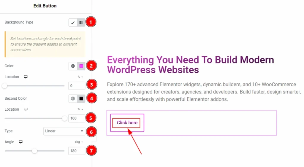
Now, let’s see what we have when we use the gradient background –
1. Background Type: You can change the background type to be classic or gradient with this option. Here we have selected the background type as gradient.
2. Color: You can set the starting color of the gradient effect applied to the text with this option.
3. Location: You can control the position of the first color within the gradient transition.
4. Second Color: This option define the ending color of the gradient effect.
5. Location: You can adjusts where the second color appears within the gradient flow.
6. Type: Allows you to choose the gradient style, such as Linear or Radial.
7. Angle: You can control the direction and rotation angle of the gradient effect for Linear gradients.
All done, You have successfully customised the Ripple Effects Extension on your website element.
Video Tutorial #
You can also watch the video tutorial to learn more about the Text Gradient Background extension.
Thanks for being with us.