Learn how to optimize ecommerce category pages for better user experience, stronger SEO, and higher conversions.
Category pages sit at the center of most online stores. They are where shoppers narrow down choices, compare options, and decide which product to click. They are also some of the most valuable pages for search, because they target broad, commercial keywords like “running shoes” or “organic skincare” that individual product pages rarely rank for.
Yet many stores treat category pages as simple product grids with a heading on top. Improving them is one of the highest-leverage changes an ecommerce team can make, because better category pages help shoppers, search engines, and conversion rates at the same time. Here is how to approach it.
Why Category Pages Deserve Attention
A product page answers the question “Is this the right item?” A category page answers an earlier and broader one: “What are my options?” Shoppers who land here are often still exploring, so the page has to orient them quickly, help them filter out what they don’t want, and make the next step obvious. When it fails, they bounce or fall back to site search, which may not be any better.
From an SEO perspective, category pages also distribute internal link authority to the products beneath them. A well-structured category hierarchy helps search engines understand what your store sells and how items relate to each other.
Design for How Shoppers Browse
Clear Hierarchy and Navigation
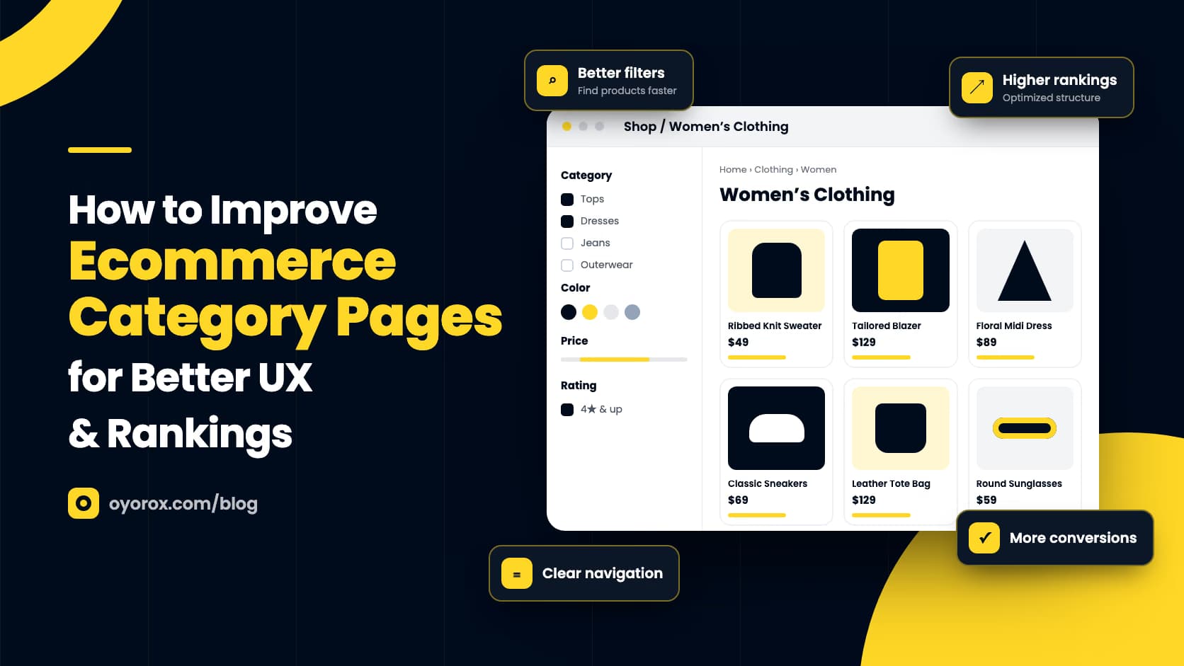
Use a logical structure that mirrors how customers think, not how your inventory system is organized. Add breadcrumbs so shoppers always know where they are, and show subcategories near the top of broad pages so people can jump straight to the section they need.
Filters and Sorting That Actually Help
Filters should reflect real buying criteria: size, price, material, brand, compatibility, or whatever matters in your niche. Show the most useful filters first, display how many products match each option, and avoid filter combinations that return zero results. Sorting options like price, newest, and best-selling give shoppers control without overwhelming them. On mobile, make filters easy to open, apply, and clear.
Product Cards That Answer Key Questions
Each card in the grid should show a clear image, the product name, price, and availability. Depending on your products, ratings, color swatches, or a short differentiator can save shoppers a click. Consistent image sizes and aspect ratios make the grid easier to scan and look more professional.
Optimize Category Pages for Search
Category pages can rank well, but only if they offer more than a list of links. Focus on these fundamentals:
- Write a unique title tag and H1 that match the primary keyword shoppers use for that category.
- Add a short introduction above the grid and, if useful, more detailed buying guidance below it.
- Link to related categories and popular subcategories to strengthen internal linking.
- Control faceted navigation so filter combinations don’t create thousands of thin, near-duplicate URLs; use canonical tags and indexing rules deliberately.
- Handle pagination with crawlable links so search engines can reach products on deeper pages.
- Add breadcrumb structured data so search results can display your site hierarchy.
Keep any added copy genuinely helpful. A few sentences explaining what distinguishes the products in the category, or how to choose between them, serves both readers and search engines better than a block of keyword-heavy text.
Turn Browsing into Buying
Small conversion details make a big difference on category pages. Quick-view or add-to-cart buttons on product cards reduce friction for repeat buyers and simple products. Clear stock and sale labels help shoppers prioritize. Trust signals such as shipping thresholds, return policies, or review counts reassure people before they commit to a click.
Merchandising matters too. Decide which products appear first rather than leaving it to default ordering. Feature best-sellers, seasonal items, or high-margin products in prominent positions, and use banners sparingly so they don’t push products below the fold. In WooCommerce, flexible product grid and filter widgets, such as those in Oyorox’s Elementor and WooCommerce toolkits, make it easier to control layout and merchandising without custom code.
Keep Category Pages Fast
Category pages tend to be heavy: many images, filter scripts, and sometimes dynamic pricing. Compress and properly size product images, serve modern formats, and lazy-load images below the fold. Make sure filtering doesn’t trigger full, slow page reloads when it can be avoided, and test on real mobile connections rather than only on a fast office network. Speed affects both user experience and how efficiently search engines can crawl your store.
A great category page helps shoppers decide what to look at next. Make that decision easy, and both rankings and conversions tend to follow.
Conclusion
Improving category pages is not about a single redesign. It is a cycle of clarifying structure, refining filters, sharpening product cards, tightening SEO, and keeping performance in check. Review your analytics and search data regularly, look for pages with high exits or low engagement, and improve them one at a time. Each improvement makes your store easier to shop and easier to find.